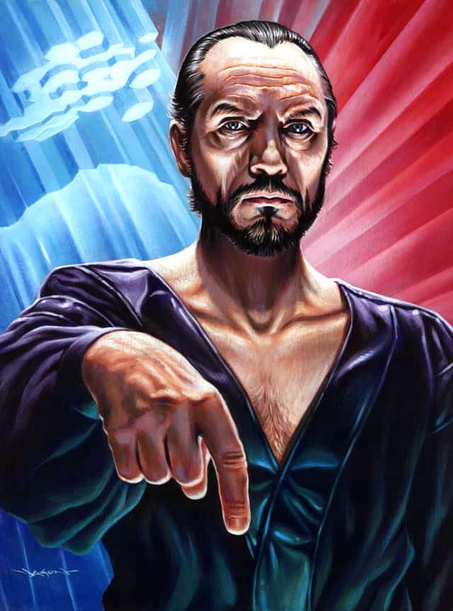
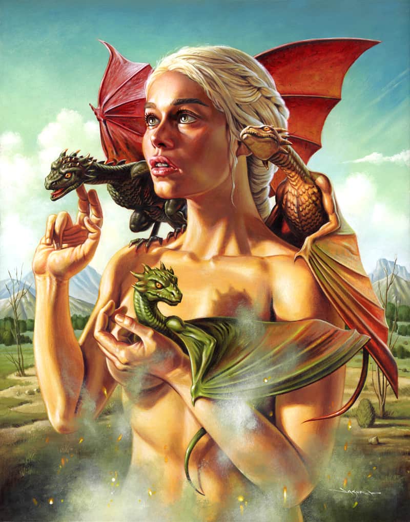
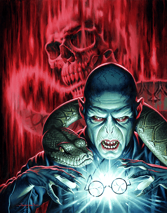
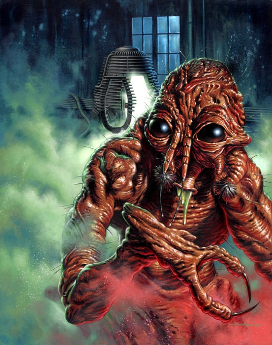
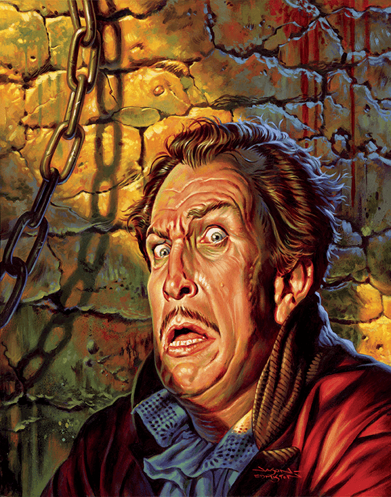
The work of illustrator Jason Edmiston is born from the visual history of classic Hollywood film posters. The portrait. The saturated color. Full of high drama. But in Edmiston’s world — the monster, the creep, the villain — they are front and center, heroes of their own story.
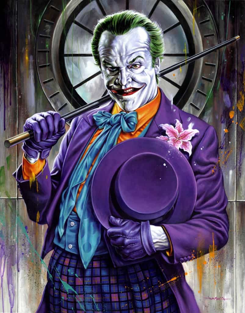
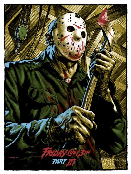
Edmiston captures the hidden charms of movie maniacs like Freddy Krueger, Jason Voorhies, and Dracula. His take on Jack Nicholson’s Joker is full of adoration. His smile hides the horror. Edmiston’s ‘Bride of Frankenstein’ hangs like royalty, her wounds, and dead flesh aglow.
Jason is skilled and aware. Able to move from acrylic to digital workflows with mind-blowing results. Looking at his work the mind boggles at the intense skill level on display, wondering ‘how the hell does he do that?’
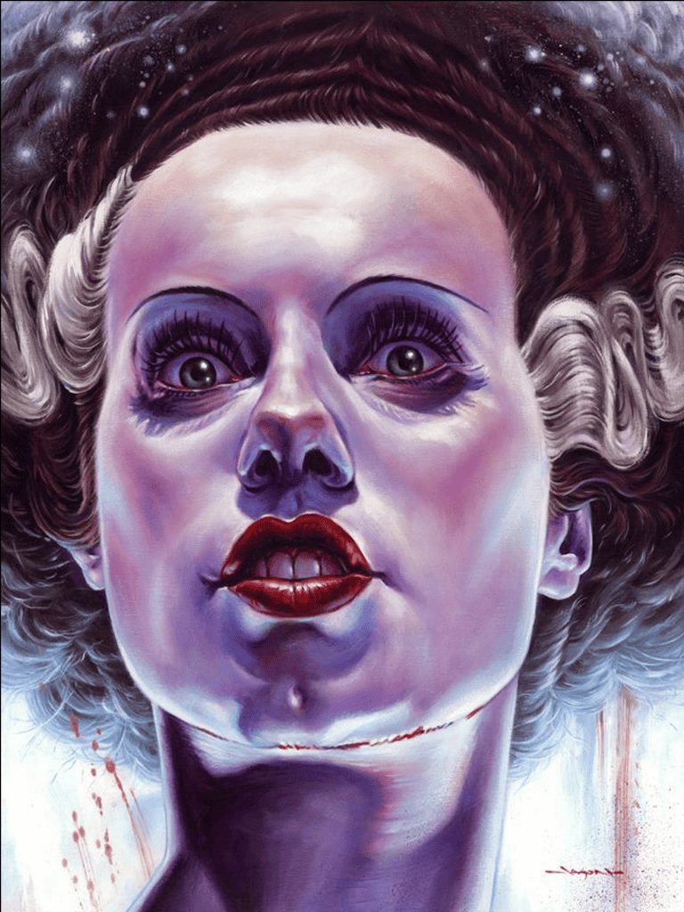
ET: One of my favorite pieces is your ‘Bride of Frankenstein.’ Your take on the character pulls in so much – the portrait is classic Hollywood, she’s a beauty. You captured her as an icon in a frightening and glossed celebrity portrait.
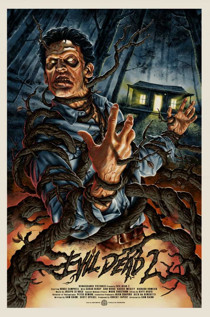
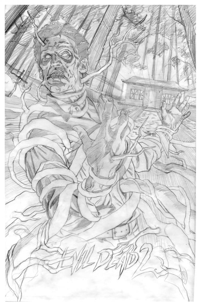
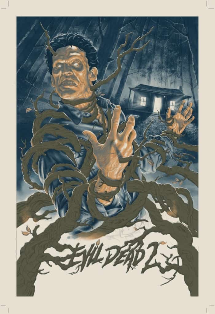
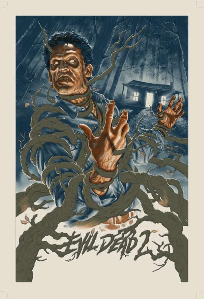
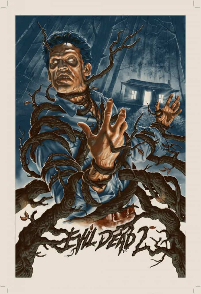
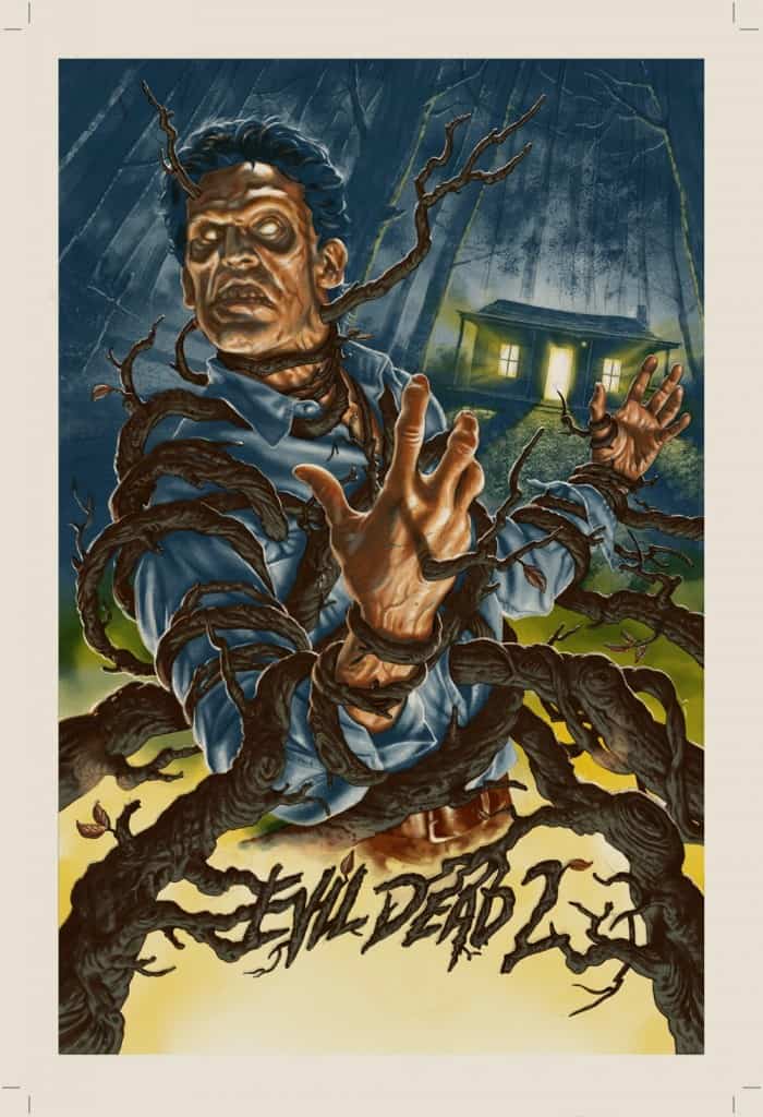
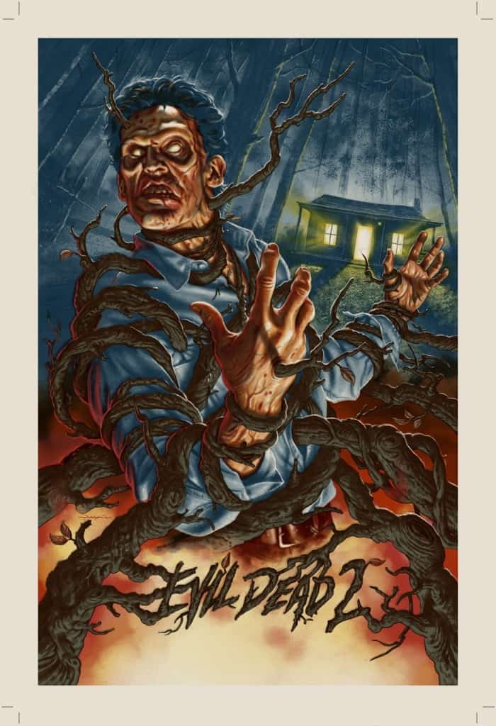
Your ‘Evil Dead 2’ poster took or more graphic approach to Ash, the film’s hero. The horror of that film is there. The composition itself is more involved than a traditional portrait. Ash is in a slice of the film, unlike the posed ‘Bride.’
When beginning a piece how do you decide on the composition? Straight portrait versus more a vignette-like in ‘Evil Dead 2.’ Is it based on the film itself?
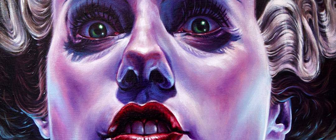
JS: Usually the subject matter decides the approach to composition. Posters work best when they evoke the mood of the films that they advertise. Bride of Frankenstein as a movie, is more reserved, and emotional than ‘Evil Dead 2.’ It made sense for me to focus on a close-up of the Bride’s deer-in-the-headlights gaze as she is reanimated, discovering her new world for the first time.
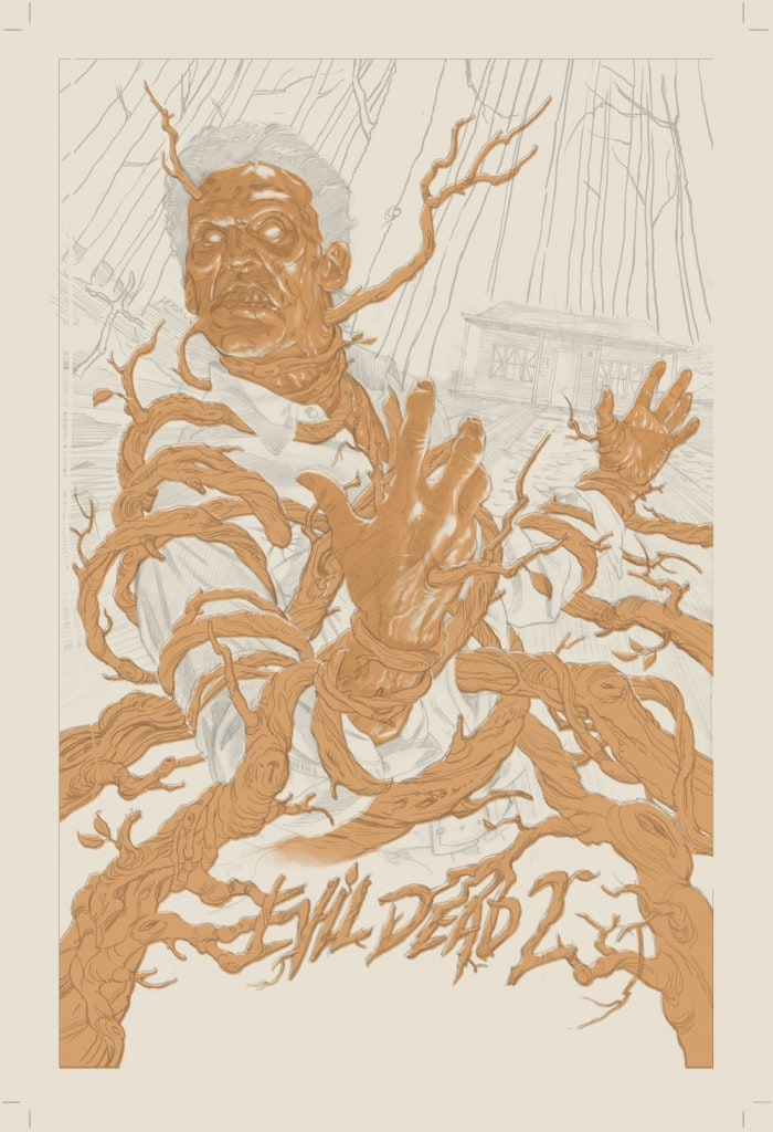
Evil Dead 2’s insane nightmare situations and funhouse directing style demanded an action pose, that surreally merged various elements of the film together in one bite-sized kinetic snapshot.
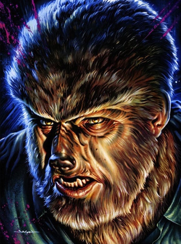
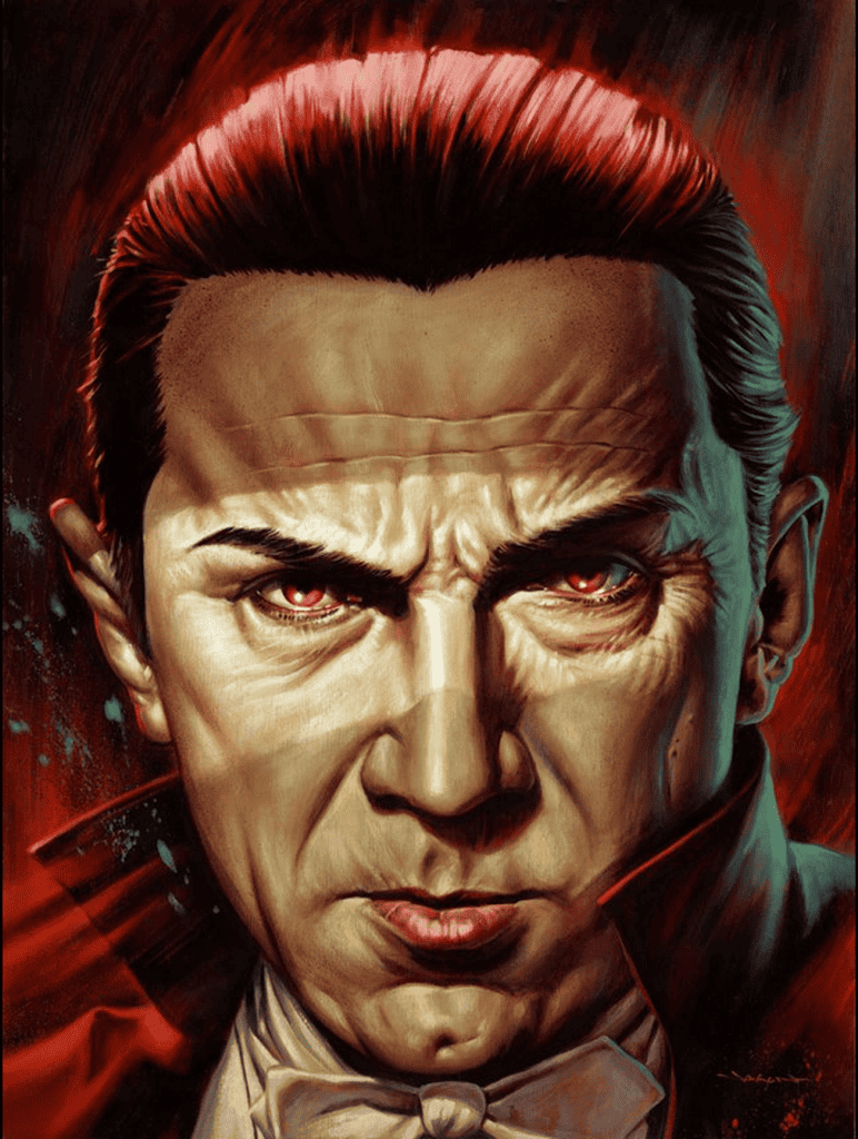
On a side note, the Bride painting (and subsequent screen print version) was part of a larger series of Universal Monster portraits, that were meant to be my take on the close-cropped monster head studies, seen on U.S. postage stamps in the ’90s.
I wanted to create my ultimate versions of these horror icons. This determined that the Bride would be a straight-up portrait, and would be followed by matching Frankenstein, Dracula, Wolf Man, and Creature paintings (also later turned into screen prints).
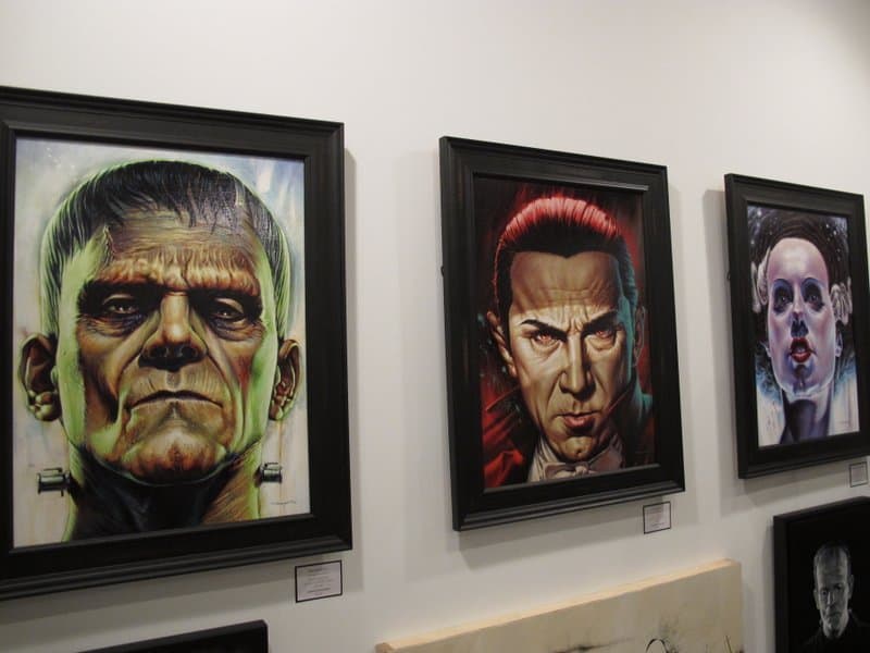
Jason Edmiston’s paintings at the Mondo Gallery for the ‘Universal Monsters’ show. (Photo from the Austin Chronicle)
There’s a romantic quality to your paintings, an absolute fondness, and adoration for your subjects, an echo of what the audience feels toward the characters. How do you decide on your subjects? Is more solely based on what you want to paint or do you consider what will sell?
It’s a little of both, but I begin with themes that I like, and if I feel that there is also a market for it, I’ll explore that idea more, by researching, and sketching concepts. I think that the love for the subject matter is always evident in the work.
If I feel passionate about the theme, the pieces tend to get a stronger reaction from the audience. They can also tell when I’m going through the motions if I’m indifferent to a property, so I really try to only take on subject matter that I feel positively towards.
I’ve been pretty lucky in my career lately that I have the luxury of picking and choosing projects, so I have quite a bit of freedom.
Your work is so incredibly involved and time consuming that I’d assume you would need to have a personal attachment to something like Jack Nicholson’s Joker to achieve what you’ve done in that portrait. But you are a professional, so is there also an element of just doing a job for a property that you might not have any attachment to?
When working on something like ‘Bride’ or your Friday The 13th pieces, is there a need, or want, on your part to personally connect to the subject in order to do a painting?
Over my career, I have done professional projects for clients, where I wasn’t personally fond of the property at first, but after some research, I usually discover something interesting to explore (facial features, costume, personality, etc). After a certain amount of reference is gathered, I become familiar with the subject and usually find a way to get excited about creating art based around it.
That being said, I did have a great personal connection to the properties that you asked about. I picked these subjects myself because of my fondness for them and wanted my versions of them to exhibit all of their most interesting attributes. My best art grows out of this love for the chosen subject matter.
‘Rogues Gallery,’ your solo show for Mondo was pretty damn amazing. Looking through your paintings just made me giddy – the paintings, for me at least, captured my love of the characters that grew in me from childhood. You portrayed the villains, these ‘rogues,’ as heroes. Bold and strong. A classic wink to the camera.
What was your process behind balancing the inherent evilness these characters were created with and bringing out the likable, or lovable quality that audiences have for them?
Thanks! That was my goal. I imagined portraits that the characters themselves would have to approve of. What if these characters had final edit? I wanted to paint them as if they posed for me like a king would for a court painter. They would need to be proud to hang these portraits in their respective evil lairs.
The pieces focused on their most interesting physical qualities, and any special powers (or potential power) that they may have. Yes, they are evil, and not exactly beautiful in the classic sense, but are attractive in their own way, and I made sure to render their nooks and crannies with clean brushstrokes, and bold colors. I feel that by taking this approach, the viewer can’t help but feel affection towards them.
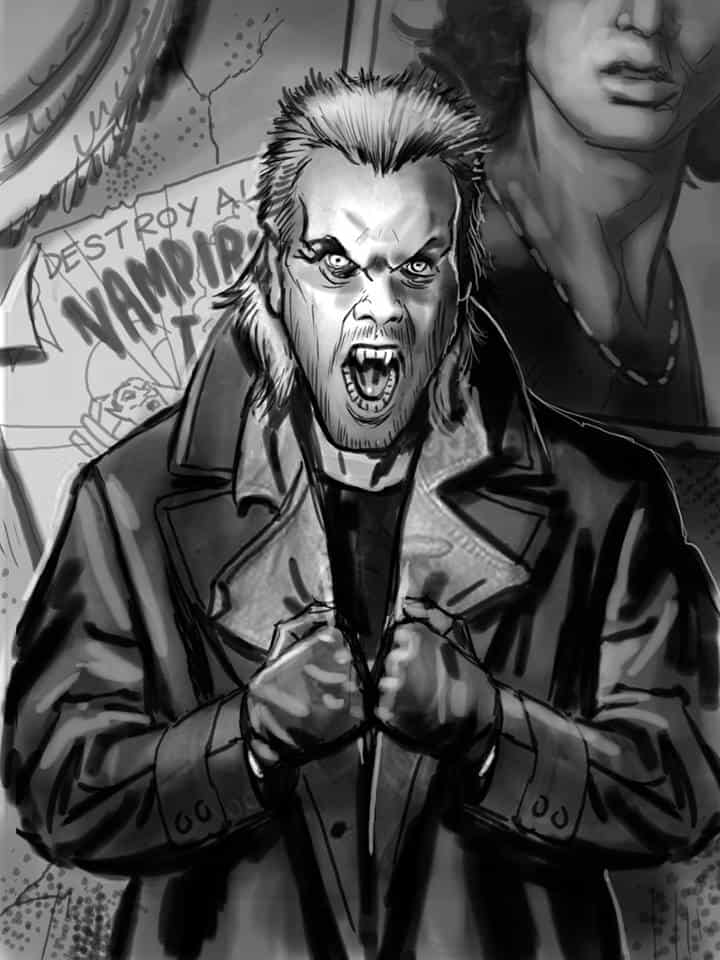
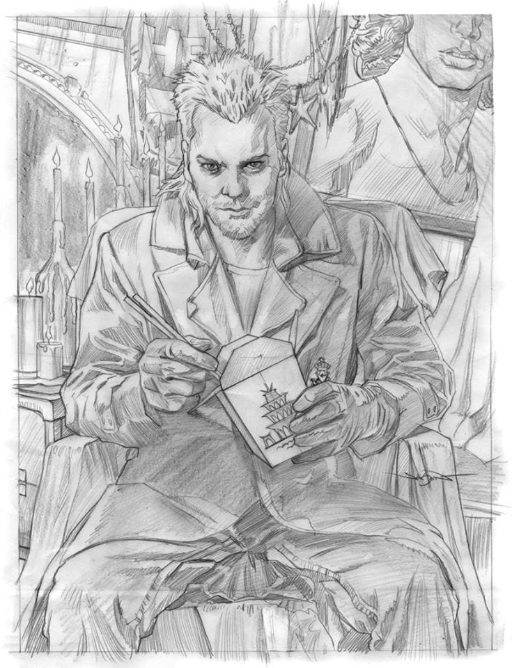
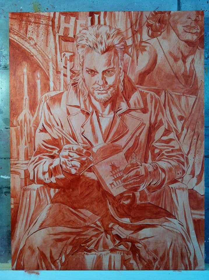
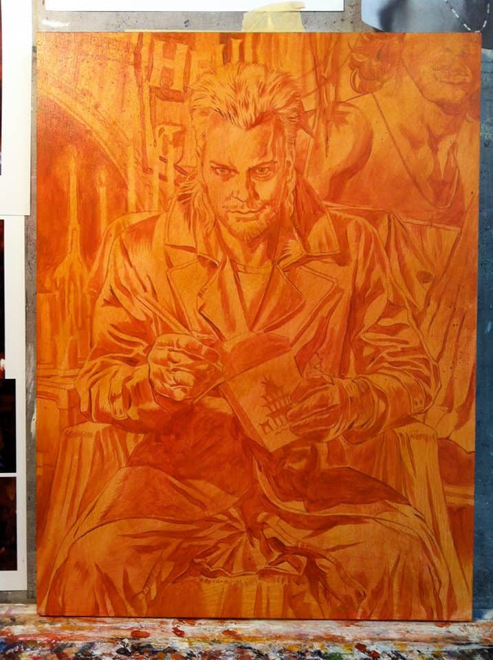
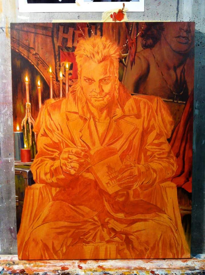
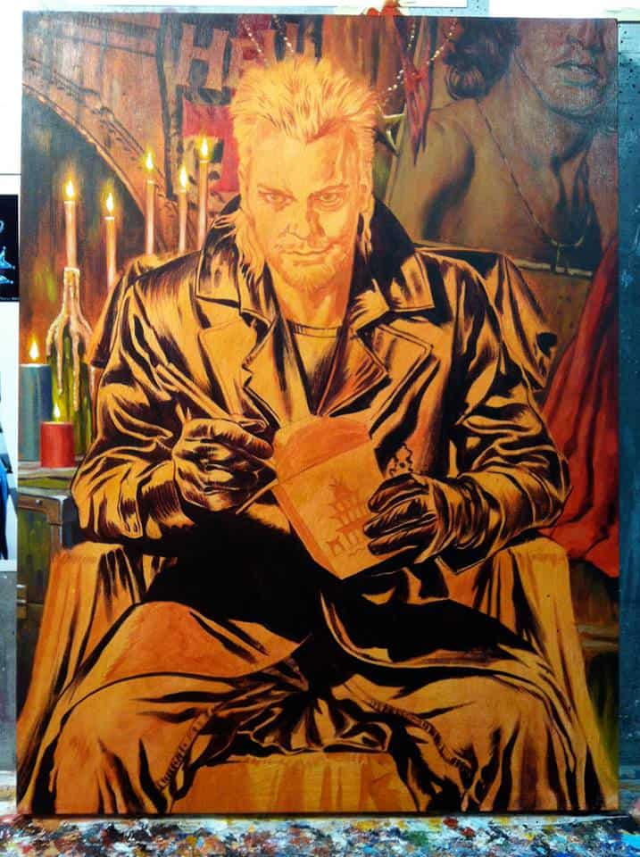
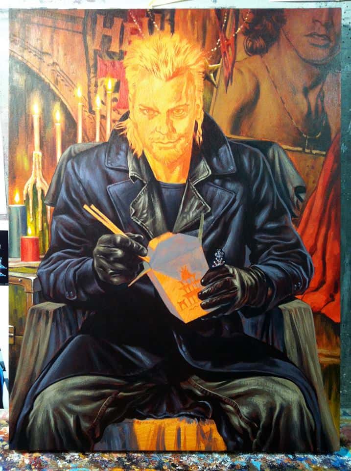
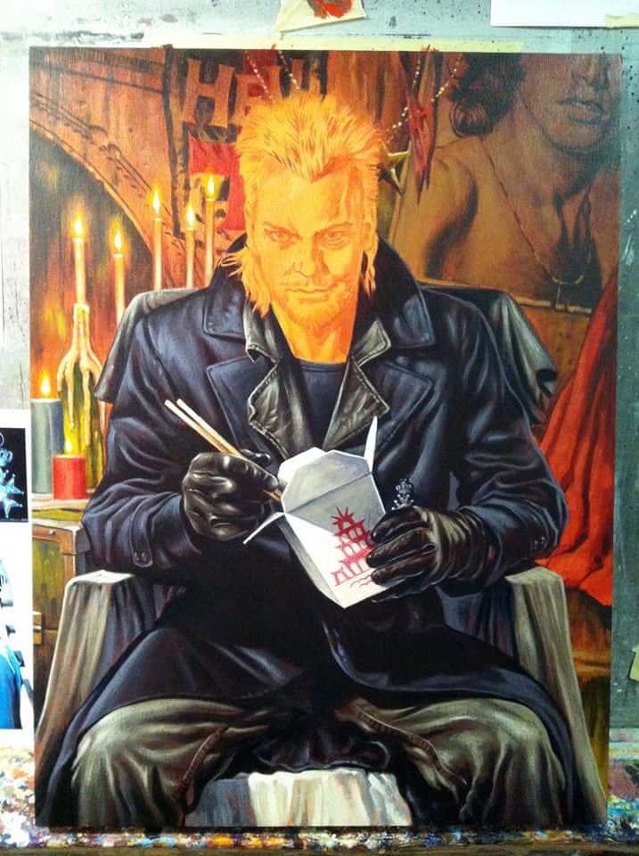
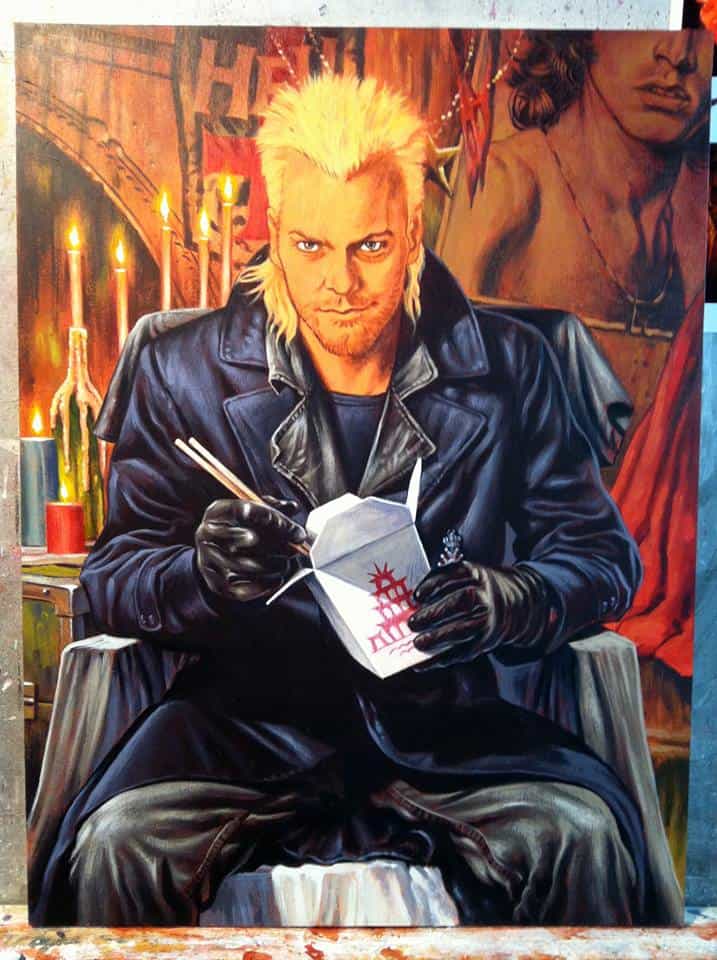
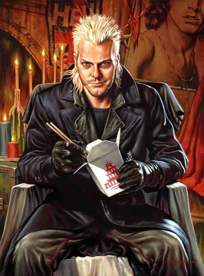
On your blog you showed a preliminary sketch of ‘Maggots,’ your ‘Lost Boys’ portrait. Your final painting is just incredible. The charisma, charm, and danger of Keifer Sutherland’s character David is alive — he’s there, confident and threatening with his carton of rice / maggots – one of the film’s greatest moments.
Your first sketch focused more on the physical danger of David. Fangs out. Ready for blood. What was the path from your initial sketches to the final product?
I sketched the two roughs at first, not sure which direction to go in. After a discussion with Rob Jones of Mondo (who helped art direct many of the pieces for my show), we decided that David’s strength lies in his seductive powers and mind control.
The audience is drawn to David, much like Michael is in the movie, because he is cool. He’s the ultimate Alpha male character. Women want to be with him, and men want to be him. My piece needed to display this quiet power, and illustrating the rice scene was the right choice for the character.
I love going through your progress photos of your paintings. It’s staggering how exact and patient you are in your work. When working with a client, how do you handle taking direction? For a digital piece, a change can be easy to make, but I’m assuming once a painting is underway there’s no turning back, just starting over. How do you handle any notes on changes?
My art style is pretty controlled. That is to say that most of the work is done at the pencil stage, which tends to be fairly tight, and gives indications to the choice of lighting. I stick pretty close to the line art when I color the piece.
I normally show clients progress at the rough pencil stage, tight pencil stage, and usually after a digital color rough, so there isn’t a lot of guesswork for the client. They know which direction I am headed. There are few surprises, and any requested changes late in the process are unusual, and they are generally minimal likeness tweaks.
A lot of your work is hand painted, but for the ‘Evil Dead 2’ you painted it in Photoshop. Was there a reason for that outside of the end product being a silkscreen? What dictates your painting method? Do you have a preference to giclee or silkscreen prints?
The only reason I did the art for that one digitally is because it was to be separated for screen printing by Mondo. Even when I create digital art for screen prints, I usually paint the “black” art layer by hand to give the print a certain organic quality.
Usually the complexity of the color in a piece determines whether I make art traditionally, and make giclee prints, or make the art in Photoshop layers for screen prints. The new technique that I have developed for my Universal Monsters screen prints (generating many colors by overlapping transparent layers) has made it possible to make layered art that is closer to what is possible with my traditional paintings, so the lines are being blurred.
Your show ‘Rogue’s Gallery’ was a stellar showing of your voice as an artist. That voice is so clear and distinct. When you first started painting professionally, did your style match where you are now?
No, not exactly. I always wanted my art to look like it does now, but my hands wouldn’t cooperate. It takes many years to develop a style sometimes. You can have a vision in your mind, but trial and error, and practice breeds consistency and confidence with an artist’s chosen medium.
There’s always room to grow as an artist though, so I’m sure my work will look somewhat different years from now, as I learn new things, and get even more practice.
Your paintings feel so perfect – like they couldn’t possibly have been done another way. The composition and color choices feel natural. Is there a creature that you felt you haven’t been able to capture in a way that you had hoped? Any monster that you’d love to try again?
I painted a 6th portrait in my Universal Monsters series, but I’d love another crack at it. This was The Mummy portrait I painted (given to my artist pal Ghoulish Gary Pullin on his birthday).
I was happy with it, but something about it didn’t fit in with the rest of the Universals. It was too monochromatic (beige on beige, with a white background), and I’d like to try again with something more dramatic lighting.
You’ve been attending Comic Con and various other conventions and shows. I even saw that you’re doing a painting workshop in New York soon. Pretty jealous of the folks who get to attend that. What part do these live events play in your career?
These exhibitions are time consuming and expensive, but I find that they are necessary to maintain visibility in the art scene, and to introduce myself to new customers. I always profit from these shows, whether it be with sales at my table, or or from future assignments from clients I schmooze with at the shows.
Freelance artists have to get out and meet their buyers sometimes, and it’s good for me to get out of the studio, and spend some time with real people.
You’ve been at this illustration work since 1996. I’m curious, how much of your day, or your work-life is business related? Do you have time to goof off and paint what you want these days?
The two are one and the same these days. I’ve been fortunate lately to work mainly on projects that I enjoy, and a lot of my jobs are self generated. That is to say that often I get to approach companies like Mondo, or Fright Rags, etc, and pitch my own ideas, which often become paying gigs.
The rest of my time I create gallery show pieces, and make prints from them to sell. I couldn’t ask for a better career. I get to spend my days creating what I want to, and get paid for it!


7 thoughts on “Interview: Jason Edmiston, King of the Monsters!”