The art of Sonny Day and Biddy Maroney speaks in a powerful language all their own. A wonderful roar. Sonny and Biddy, or better known as We Buy Your Kids, are a design duo from Sydney, Australia. Their work exists at a gut level.
The posters they created for classics like ‘The Shining’ and ‘Poltergeist’ get to the heart of the films – not story-wise, but that moment when you realize that Jack Torrance has gone mad and that poor family won’t leave the same way they arrived spills out in violent and raw shapes. With simple color and design, WBYK splash out Jack Torrance’s inner-demons on a sheet of paper.


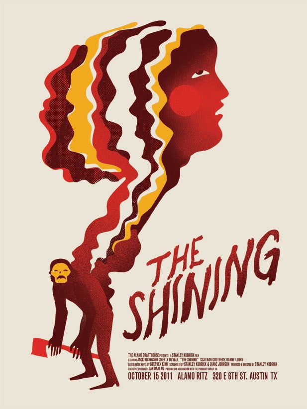
‘The Shining’ by We Buy Your Kids
CJ: What I love about your work is the way you’re able to quickly tap into the heart of a film. In your poster for ‘The Shining,’ you get right to the emotional meat and internal decay of Jack Torrance without explicitly depicting the violence and turmoil he creates. It’s there, inside of him, creeping out in shades of blood. There’s a visceral quality to your designs. The poster’s focus is on the internal frenzy of the main character rather than the story.
This seems to be a theme in your film work — For ‘An American Werewolf in London’, the image is playful – a man in a werewolf mask holding the UK flag, something that didn’t happen in the movie. This poster approaches the film differently than ‘The Shining,’ but still in an absolutely unique and bold way. There’s brilliance to how well you find the movie’s core in such simple images. When setting out to design a poster for a film, something that is an existing property, how do you choose what the focus should be?
WBYK: Thanks! The Shining was the first poster we were asked to do for Mondo and we got excited and overwhelmed by the prospect. Then we re-watched it and kept finding that every visual aspect of that film has already passed into being an icon of popular culture — the maze, the carpet, the typewriter.
There’s so many other artworks that reference the film, whether it’s homage or spoof. So we had loads of initial ideas but with most that tied back to something on set we felt like we’d seen it before somehow, or the idea had already been explored in some way. Like it was over-familiar.
Sonny sketched that psychic head character coming out of the hunched figure with the axe really quickly. We submitted our sketches and were so happy when Mondo came back and chose that one because we felt more excited about it. Like avoiding anything too literal or directly representative of what’s on film let us convey more succinctly what the film’s about.
It varies from poster to poster, but in general, we feel like we can communicate more dealing with symbols instead of literal references, it opens things up. To be honest though — in many ways, it’s just what comes out, and that’s how we draw. Sonny’s sketches and artwork are pretty psychedelic and that’s the way he sees stuff a lot of the time. Then we discuss it and it gets more ideas thrown in and just becomes what it is.
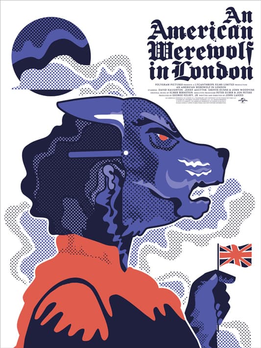
‘An American Werewolf in London’ by We Buy Your Kids
American Werewolf was kinda similar — we were working on a different approach from a sketch of Sonny’s again, but Biddy didn’t quite enjoy the image, so had troubles working with it. It wasn’t coming together in a way we liked so it was getting frustrating. Then we were just talking about how we both felt seeing that movie at early ages — and the confusion we both had because it wasn’t horror as we knew it at the time, it was also hilariously funny.
To our smaller senses that was a new and disorienting phenomena. Then Sonny sketched the mask/flag image, again very quickly, and we were able to build it into a poster with a lot more energy because we were both really into the idea of it being a horrific comedy.

‘Beetlejuice’ by We Buy Your Kids
Your ‘Beetlejuice’ poster is incredibly smart. It’s not obvious – it takes a few seconds to piece it together, and not because it’s visually complicated, but like ‘The Shining,’ you got to the core of the main character. More than wanting to be free and in the real world, Beetlejuice wants the ladies. He wants to get laid.
I’d have to imagine that the process of getting a design approved without the main character appearing couldn’t have been easy. When commissioned for a piece and the client insists on incorporating an element like a main character or a certain visual, would you go against your own desires and make it work? I guess it comes down to this, if the client had insisted that we see Michael Keaton’s big head on the poster, how do you handle a situation like that?
We’ve been really lucky to not have had much at all in the way of briefs for the film posters we’ve done. Rob and Mitch at Mondo, who have been commissioning us, have always given us loads of space to present initial ideas and we can’t thank them enough for that. They’ll give us feedback and advice but have always been very open to what we’ve sent through as first ideas.
We realise there must be back and forth with studios and approvals and whatnots, but we’ve been lucky to be left blissfully out of most of that. If the brief was to focus on a certain character that would be no problem – that’s what we’d do. But the brief for us is usually just the film title and then what we make of that. I imagine they show our stuff to whoever has to approve it first to see if they are into it or hate it.
‘Beetlejuice’ is actually another one where we were working on another idea and it was getting too bogged down and that was just another approach we did to kind of get some fresh air on it. Biddy drew that one initially as a bit of fun. The idea that these characters that are on screen for hardly any time, and the female characters, in particular, were a good representation of the whole film came through as a secondary realisation. The Vargas style pinup pose of the girl in the waiting room was a bit of a study, but it was fun to create. So we thought if we added in Beetlejuice by adding his disembodied hand doing a bum-pinch it could be the poster – in a sort of ‘Carry On Ghouling’ way.
We were toying with the idea of doing every poster in that exhibition that way, using secondary characters, and it went with the fact we were calling it ‘Tina’s Mom’s Boyfriend’ since he’s a guy that just walks on in ‘A Nightmare on Elm Street,’ asks Tina’s mum if she’s coming back to bed, and walks back off.
It was a nice idea to approach every movie that way but it didn’t work for all (including Nightmare) and we didn’t want to force it, so we kind of just left that idea behind.

‘Nightmare on Elm Street’ by We Buy Your Kids
That’s a pretty brilliant approach to the show, all secondary characters. It seemed to be a solid starting point for what turned into an awesome collection of posters. What’s the balance when working on something like ‘The Thing,’ a film that is a classic with a huge and vocal fanbase. What’s the responsibility to the fans? To the client? To yourselves?
Well, we love John Carpenter and Sonny, in particular, is a giant fan. We have total respect for what’s come before, and how huge it is. But we think if we considered the fan base response too much we wouldn’t be able to get a free flow of ideas going.

Slow Club poster by We Buy Your Kids
Posters like your Slow Club tour poster for 2012 or the fantastic 2012 tour poster for Best Coast are made of such simple colors and shapes, but they’re warped into insanely creative statements. Your wall installation for the ‘John Carpenter’ show at Nine Lives, heck, even your ‘John Carpenter’ logo, have a wonderfully blunt readability to them – they feel like symbols, a newfound language, a totem, designed by you.

Poster for the We Buy Your Kids’ ‘John Carpenter’ exhibit.
Your posters have such a strong visual voice to them. Is the work of WBYK the result of two different styles merging, or did you two start out with common styles that worked well together?
Thanks again! That Slow Club poster actually went through about 5 million revisions – just our own revisions and indecisions, not changes from the client. It was originally much more complicated and had to get tortured into the simpler result that it is.
We did have two quite different styles before we started working together. But now we both kinda draw the same. It’s taken about 5 or 6 years to develop into what it is and it’s a third hybrid style that’s come from working over and with each other I guess.
Sonny definitely spearheads that these days — he’s the one doing the pencil sketches so he’s developed that third style further and into his own now. There’s hardly ever actual line work in our end results, though that’s something so personal and really identifies who draws what so we usually break it into shapes so we can both be working on it. Making the characteristics of two separate styles of linework would make it difficult to create one cohesive end image.mIt’s basically convoluted and a little difficult to extract it back into who does what exactly now. Someone suggested recently that it didn’t matter. Not long after we started working together we had an exhibition, and many of our friends that had known us as working separately for many years came along and we seemed to be asked constantly who had done what in the images.
We were describing that to another friend and she answered very simply ‘Well it’s obvious – Sonny does the straight bits and Biddy does the curvy bits.’ We were happily shocked she was kinda right. That was in 2007 and last year we showed the same friend some pencil drawings we’d done together and she said ‘well these are all Sonny’s’ and it was actually all 50/50. So I guess we’re a murky puddle of flavours now.

Best Coast tour poster by We Buy Your Kids
When working with bands, how familiar do you need, or want, to be with their music before taking on the job? How much input do you want from the band?
It’s crucial that you’re familiar with the music, but varies wildly regarding band input. The music is what your images have to come from. The band has to like what you’re making — they’re hiring you. We try and go with the flow, but it’s best if there can be an actual meeting in person, or conversation to see what the band thinks.
So many times we don’t get any brief, or a super vague one, just a request to ‘do what you do.’ But of course, most people don’t know what they want until they’ve been shown what they don’t want, so that can end up in a massive waste of time and ideas. Usually, the best results happen if a conversation can start about ideas before we send through any sketches.

They Live by We Buy Your Kids
One thing I totally love about your work is the handmade quality to your designs. I can imagine you guys cutting up colored paper and constructing something like the ‘They Live’ poster. What are your main tools? Are there any practical tools, or is it all digital?
A lot starts with pencil sketches, and then it all gets put together on a computer. Sometimes it comes back out to be painted on a wall or something. It’s a lot of back and forth and a lot of discussions about it all and where it should go. Some jobs go back and forth with tracing paper and scans and printouts and repeats.
The digital work is all in Photoshop, which we prefer cos stuff can get a bit murkier — crisp edges get a little blurred and it feels a little warmer for us to work that way. So the end result, even though it’s created digitally can have a memory of something tactile. We started working together doing screen printed posters so the end result was a hand-pulled print but these days a good majority of what we make is printed digitally.
Sonny’s working on a solo exhibition (‘Sex Mission, Sex Metal Hands. Watch Out For The Cops.’) of paintings at the moment and that kind of end result is something we’re both keen to pursue more, but when we’re working on a job the constraints of deadlines and budgets mean our end result is usually digital. Paper cuts are something Sonny’s had a muck around with but we’ve not had the time or right job to do more with it.

Sonny Day’s solo show ‘Sex Mission, Sex Metal Hands. Watch Out For The Cops.’

Sonny Day working on his solo show ‘Sex Mission, Sex Metal Hands. Watch Out For The Cops.’
I’ve seen some of your pencil sketches and it’s awesome to see the works in progress. Does every job start off with pencil sketches? Do you work on a color palette before you start a job? What’s the process of going from, ‘Hey! New job!’ to turning in the final product?
A lot start that way. There’s a bunch of work we do that’s more design-oriented – logos or more commercial work with a more prescriptive brief, but illustration wise we usually start with sketches.
Lately, Sonny’s providing a lot of sketches that are more realised and complete – in the past there might have been 4 or 5 fragments of images that were edited and put together and built into a new imagery on the computer. Lately, we feel happier with jobs where the pencils get to a more completed point before they get onto the computer.
This is a common process of us deciding colour palettes:
Biddy: “So what colours did you see this being?”
Sonny: “Well I kinda saw reds and oranges, pinks, blacks, yellows. Browns. A little blue and green.”
Biddy: “Okay so not purple or grey then.”
Job ends up purple and grey.
Often the colour palette is just kinda inferred in the brief or the subject matter and we don’t need to discuss (argue) it though. Biddy prefers to work with a limited colour palette. It gets too confusing otherwise, and since we started off with screen-prints we were initially always trying to keep the ink colours down. It seems to have just evolved that this is the way we still work now, regardless of how it’s printed.

‘The Wrath of Khan’ by We Buy Your Kids
When it comes to the figures in your work, they seem to be either people shape swatches of color, like ‘The Thing,’ or manipulated photographs like you Tommy Dassolo posters or the USA tour poster for The Laurels.
For ‘The Wrath of Khan’, Khan’s face is implied, not directly drawn. As someone who went to art school and suffered through figure drawing classes, being told by instructors ‘what a person looks like,’ I absolutely love the attitude behind your figurative work. It’s as if you’re saying, ‘You know it’s a person. What else do you need?’
There’s an exploration of the human form in your work, where over the course of your posters you can seem the body become a set of blobs, fractured and colorful. What’s your approach to incorporating figures, whether a band or a character, into your designs?
That fractured, blobby style is something Sonny has developed from all the stuff we’ve done together and it’s also something that was somehow always present in both our work before we teamed up. Sonny used to draw a lot of robotic style figures with limbs dropping off.
Biddy drew a lot of female mannequin-style figures, missing an arm or leg. We have no idea why this is really, but it is a common theme in our old work so it makes sense that’s how the style’s evolved now.

Mountain Goats gig poster by We Buy Your Kids
We Buy Your Kids has a very specific style – I can imagine that if you get hired for a job, the client is coming to you for what it is that you do. When did you feel confident in your style, your creative voice? Did you struggle to try to be like other artists, or did you have an idea of what direction you were headed as an artist?
It is great that we are approached to do what it is we naturally do – in that regard, a lot of the design jobs we’ve done already have their concept developing before we start, because the decision to hire us already presents a certain tone.
In the past we’ve wondered if our design work was too ‘samey’ since it’s generally an illustrative approach. And as illustrators we’ve wondered if our stuff was too diverse because we had a bunch of more designey jobs in our illustration portfolio. The good thing is that it doesn’t really matter.
And to tell you the truth we’ve kinda been going hell for leather for a while now so we haven’t really worried about what our voice is, cos we’ve just been cracking on to get the job done and just trying to make some image that’ll grab attention and accurately describe what the focus is.
Whatever style we have is a sum of our influences and just a form of handwriting that’s evolved organically, and under pressure of deadlines. Hopefully, it’ll keep moving along but we don’t concentrate on that too much. It’s a means to an end – how we get ideas onto paper, and our aim is to keep enjoying doing that. It’s probably been a great benefit that we already had our own styles individually and were a bit older before we teamed up, cos then all we’ve been concerned with is meshing them and making the end product work.

‘Conan the Barbarian’ by We Buy Your Kids
Your show for Mondo, ‘Tina’s Mom’s Boyfriend’, covered a big number of classic films. What was your approach to picking the films? Did Mondo have a say in your final choices? That show must have been a ton of work – outside of the all the posters, you also had to travel from Sydney to Austin, Texas for the shindig. What was that experience like? Is it something you’d do again?
Mondo are amazing and we chose from a list, and basically just picked whatever jumped out as favourites. We made our own personal lists then debated through them so we had a final selection that we had an agreed interest in or love for.
It was a ton of the most exciting work we’ve ever been asked to do and we loved it and would do it all again in a heartbeat. It’s probably one of the best things that’s happened to us — from our shocked incredulity at the email offering us the show, to all the scrawling of ideas on beer coasters, making the actual work, and the bit where Mo opened the doors of the exhibition to us and said “Welcome! Congratulations!” That bit was magic.
Actually being in Austin was insane. Meeting everyone that is Mondo, hanging out at the gallery and painting their walls. Eric Nyffeler (Doe Eyed) came down and we got to meet him. Jay Shaw too. Everyone was so great. It’s actually nuts. We had never been to America before so that was a hell of a first impression.
Also, Sonny got to shoot some guns and Biddy fell in love with a supermarket. We are pretty stoked on Austin. We went to see a bunch of movies at the Drafthouse. The first time we did we just sat for a while going “nooo…. really?….. noooo” cos it was better than we’d imagined.

‘Jurassic Park’ by We Buy Your Kids

‘The Warriors’ by We Buy Your Kids
Austin is a fantastic place. It’s a great city to make your first visit to America, and Mondo and the Drafthouse are unique and special places. For a show like that, or any other project really, do you do your own printing? Is there a WBYK print studio, or do you send that part of the job elsewhere?
There’s a carousel wedged up in the corner that we’re getting rid of. It’s basically the reason we started working together. Sonny had borrowed it to do some shirts and then we were asked to do some posters. But it’s too big now and taking up space. Sonny would originally print stuff on the floor in our oversized front room. It was fairly chaotic, but fun.
We were only originally making posters after hours for fun and somehow it evolved into a business, and now we have no time for such fun. But we’re working all the time on stuff we’d never have imagined in our wildest dreams, so neither of us care about that — most of our stuff’s digital now or printed elsewhere.
I just watched the Creative Mornings video with Sonny chatting about how We Buy Your Kids came about. One thing that I’m impressed by is your very level-headed approach to the problem. You were in an interesting position where you loved your day job of making coffee and roasting beans and slowly got WBYK running.
When did you realize you could make money with your art? Was there any ever moment where you thought, ‘I’ll just make coffee forever’?
The decision to go full time doing WBYK had to be made because both businesses were getting busier and busier, and needed more time than could be split between the two. Choosing to create art full-time was just the obvious choice at the time, because it was the rarer opportunity.
But Sonny always loved working with coffee, so going back to doing it one day a week opened up some new ideas and viewpoints about what we do. The main one being you should do it your own way, and if you can do what you enjoy you’re going pretty good.

Sydney Opera House by We Buy Your Kids
Is there a trick for navigating a working creative relationship with a partner? Is there time for a personal life separate from work life when there are friendships involved? Does it all blend together?
We don’t know! Is there a book you can recommend? Honesty there is no separation — not with what we do. We’re so lucky that what we do for work is based entirely in our own hobbies and interests.
We’ve been a couple for 12 years, the house we’ve lived in for ten was our studio for five or so. If we were to have an extended break from ‘work’ we’d probably both use it to make any of the massive lists of projects we’ve dreamed up. So it’s a big blur. A great, big, mucky blur.

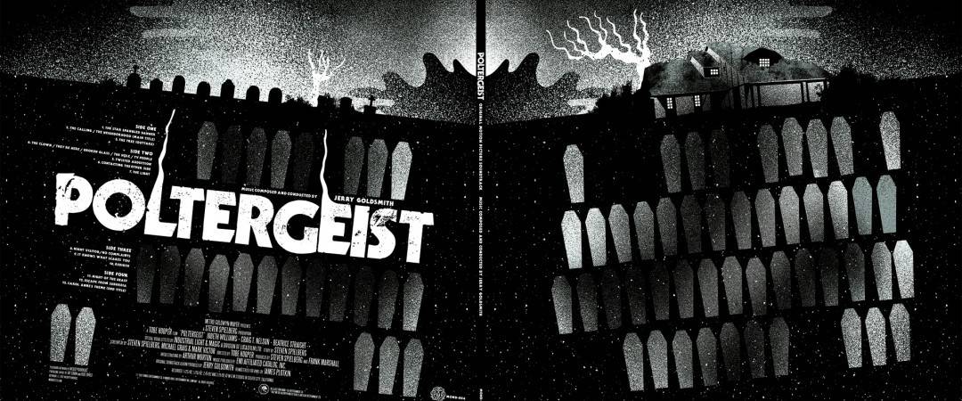
Gatefold designed by We Buy Your Kids for Mondo’s release of the ‘Poltergeist’ soundtrack.
Big huge thanks to Sonny and Biddy for playing along and chatting with me. Truly loved it and if you have a spare thirty minutes, watch Sonny’s talk on ‘Creative Mornings.’ An intelligent and straightforward talk about managing a job while trying to pursue a dream. Solid stuff.
To follow them through digital space just use these handy links —

2 thoughts on “Interview: The Visceral Design of We Buy Your Kids”