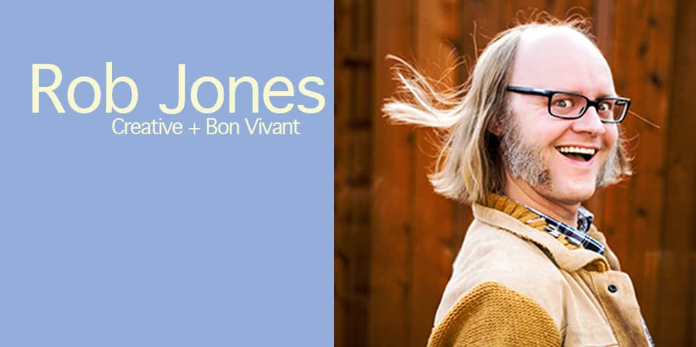
Whether you notice the illustrator’s work is subject to context. A film poster needs the film to exist first. Album artwork needs the band, the music. An illustrator is a shadow existence. Behind a curtain, working thankless magic.
Of course we see the work of artists, illustrators, writers, actors, designers — all creative types, in our everyday life. Not all get recognition and that’s all right. That’s the nature of the work. A job appreciated by small but rabid bunch. I first heard the name Rob Jones from an interview I did with illustrator Rich Kelly. Then Jay Shaw. Kilian Eng.
Illustrators I admired and respected kept bringing up the impact that Jones had on their designs. As a creative director, he’s the link between craftsperson and client.
You’ve seen Rob Jones’s work even if you don’t know the name or the face. Jack White. The White Stripes. The Dead Weather. The Raconteurs. Mondo. Criterion.
His designs are a major part of the mainstream and it was a total pleasure to get a chance to chat with Rob about all it is that he does — the hows and the whys. The spirit and internal caw of a man who can’t help but be…I don’t know if this is correct word, but it might just be — brilliant.
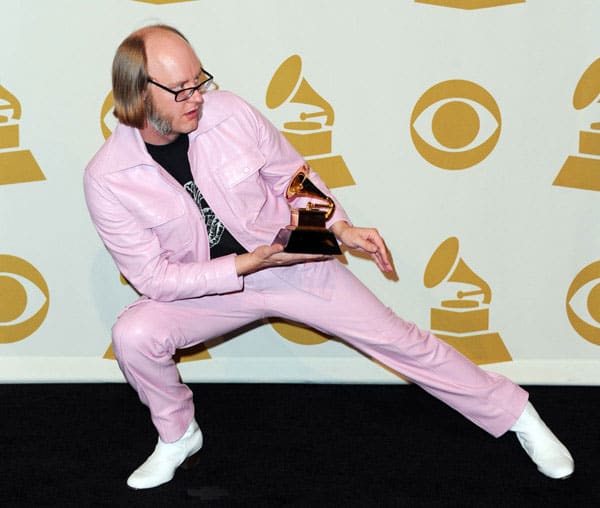
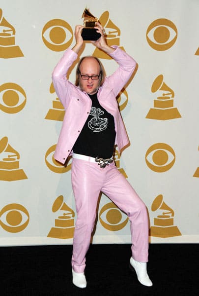
Rob Jones celebrating his Grammy win for The White Stripes’ box set ‘Under The Great White Northern Lights.’
CJ: In 2011 you won a Grammy for your work with Jack White on The White Stripes’ ‘Under Great Northern Lights’ limited edition box set. You come across as a wildly joyful and energetic guy, and it was awesome to watch you accept your Grammy with that full enthusiasm and just soak up the moment, which is what everyone hopes they would do if given the chance.
Did winning offer you any new opportunities? Do interesting job offers show up once you’ve got a Grammy in your hands?
RJ: ‘Joyful and energetic’ — two adjectives that forever fall out of people’s mouths when describing me. Certainly not ‘surly and pissy.’ Definitely not ‘that creepy bald guy smoking in the corner and muttering to himself.’
It was a charge hearing my name called. However, the winners ahead of me took forever sauntering up to the stage. I knew that was going to drag the ceremony out. I wanted to put a rush on it as a courtesy to the folks sitting through the entire affair, so I put on my PF Flyers and jetted. Super surprised I wasn’t winded when I started to yammer.
As far as job offers go, there wasn’t any discernible gain in quantity or quality of job offers. Folks generally know me from the work I’ve done for Jack’s various projects. That’s pretty much the alpha and omega of what generates hiring interest in my meager skillset.
Don’t get me wrong though, I’m still goofily elated to get any sort of recognition whether it’s a Grammy, 3rd place Art of the Year from Expressobeans, or my speech certificate from 1st grade that acknowledges I can pronounce ‘R’s.’
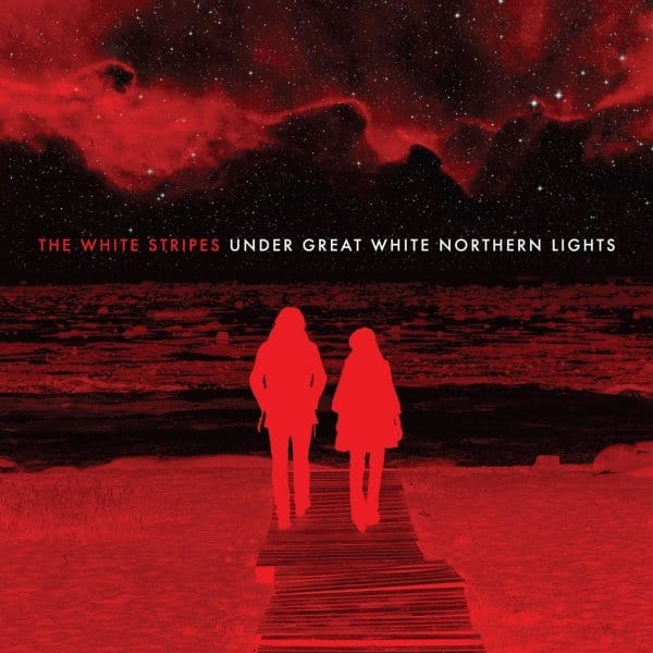
The White Stripes ‘Under Great White Northern Lights’
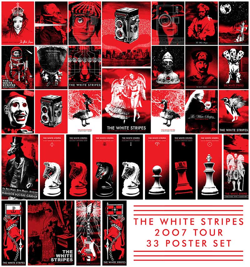
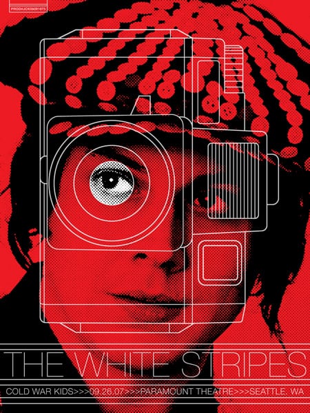
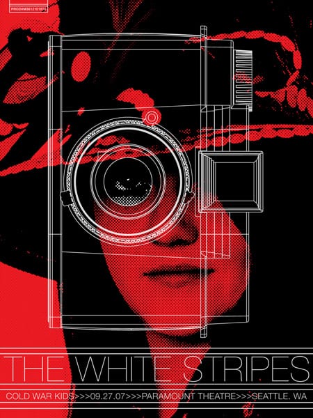
Rob Jones’ set of gig posters for The White Stripes 2007 tour.
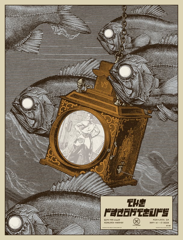
Your work with Jack White is pretty extensive – you’ve done gig posters and packaging for each of his musical acts; The White Stripes, The Raconteurs, The Dead Weather, and his first solo release ‘Blunderbuss.’ The visuals behind The White Stripes have always been a large part of their personality. I would imagine that Jack White has a lot of input into what bears his name.
Does he act as art director for all of those projects? For the 33 (!) gig posters that you released for The White Stripes in 2007, is he there during the process for each one, or letting you play around with the designs as you please?
For album artwork, yes very much so. Same goes for other band members. Some are more vocal than others, of course, but it’s a group effort for sure.
There’s more of a laissez-faire attitude, however, with posters so long as it adheres to the color palette. It all has to be submitted for approval, of course, but I generally just get a set of dates and go. There are exceptions. For example on the 2007 tour, Jack was more leery about the poster for the 10th-anniversary show due to the importance of the gig. As a result, I went through about 7 to 10 ideas before landing on one that made him grin.
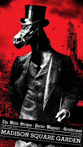
The White Stripes at Madison Square Garden poster by Rob Jones.
Another was the Madison Square Garden show as he didn’t want any prominence placed on the name ‘The White Stripes’ when sharing a bill with a legend like Porter Wagoner (or Nick Cave’s Grinderman for that matter). Otherwise, it’s usually ‘Here’s the idea I had and here’s the final poster.’
Here’s a tip for young designers if you can work fast: send in finals or near finals. Don’t rely on the client to fill in the gaps in their head. Their mind’s eye by nature has a different monocle on than yours.
For the last Raconteurs tour, I can’t recall any instance of posters getting rejected or requesting changes. For the Dead Weather tour, the only direction I can recall was ‘Enough with the gun-faces’ after I turned in my fifth one. I’m sure that was a sentiment shared by Dead Weather fans as well, although I’m still enamored by those posters.
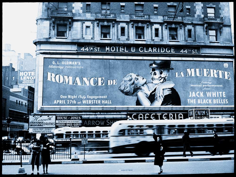
Jack White in New York gig poster by Rob Jones.
For the solo tour, the only change I remember Jack asking for concerned the NYC ‘Romance de la Muertos’ image. He asked me to try out a hat on the skeleton, and It definitely helped the piece.
Here’s not-much-of-a-secret about that poster, the ‘Horvath Papaya Drinks’ sign serves as the printing credit for Steve Horvath of D&L fame.
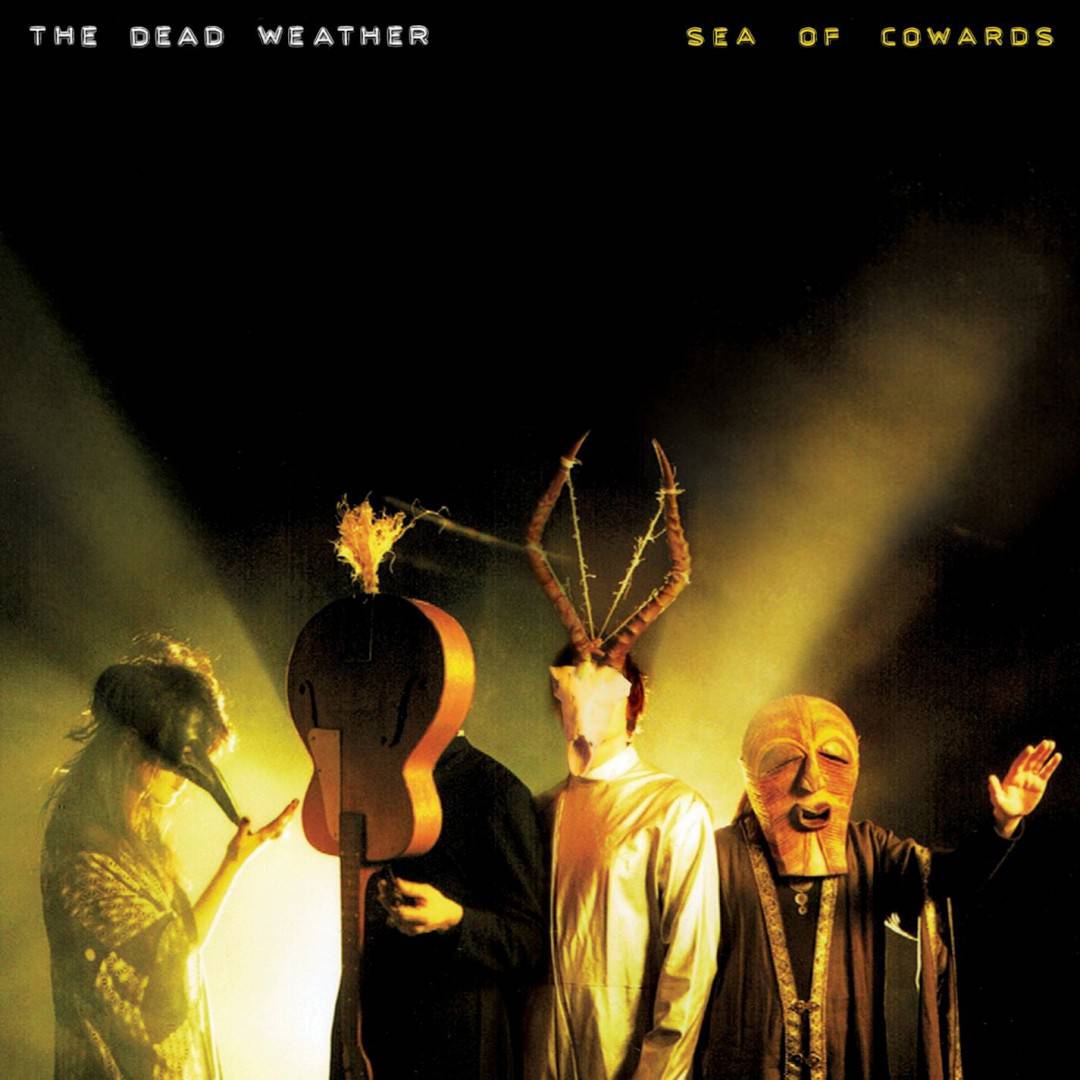
Rob Jones’ cover art for The Dead Weather album ‘Sea of Cowards.’
In your work for Dead Weather’s Sea of Cowards album, you used photographs from the band’s shoot with Floria Sigismondi. On jobs like this, are you working with the band and photographer before the shoot, or do you just get the photos and told to go for it?
For big band LP releases like this, I don’t have anything to do with the band photography, costuming or set-ups. Sea of Cowards was strictly between the band and Floria. I just receive a ton of photos and try to figure out the best way to make a cover from them.
That said, Sea of Cowards was a little different as the band eventually landed on not using the actual photos but rather some quick polaroids that Floria shot on set which had a great uncanny quality to them. I did about 12 treatments on those before the band chose one that they were all pleased with.
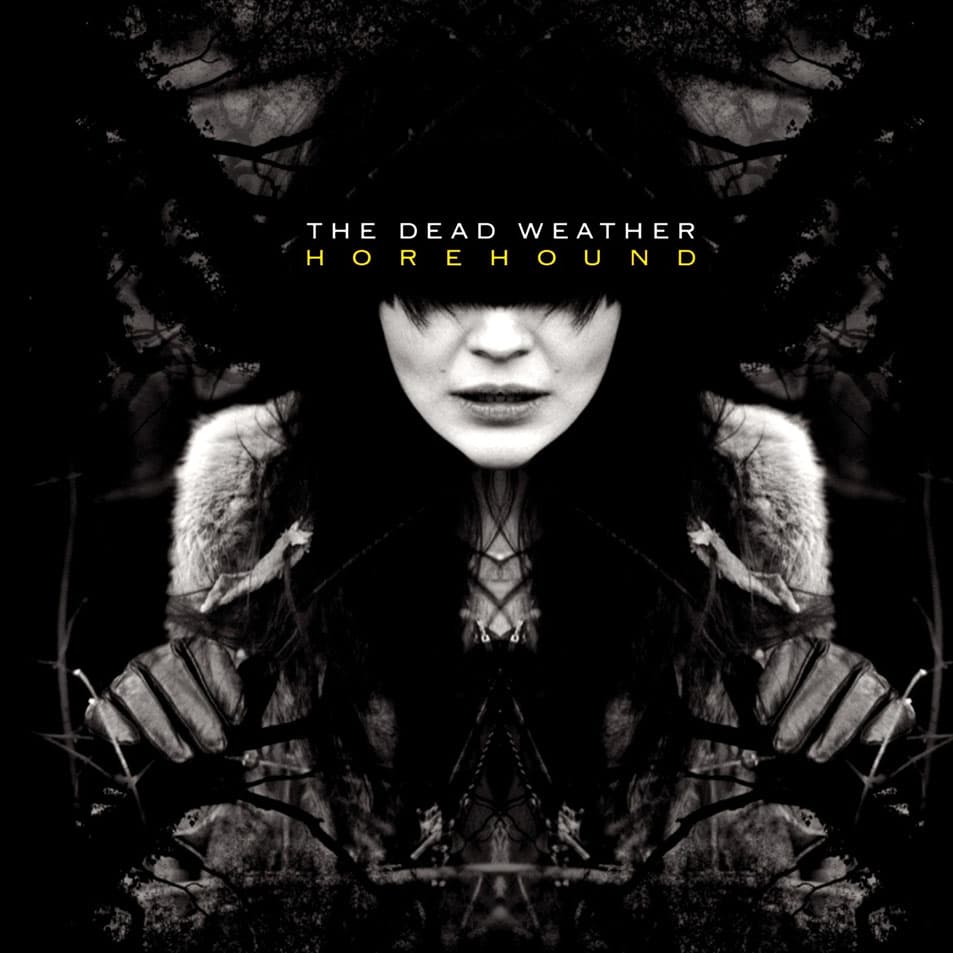
Rob Jones’ cover art for The Dead Weather album ‘Horehound.’
The problem with Horehound, however, was that there wasn’t a big pile of photographs for a front cover. Just a solitary photo that they all liked but had already flogged to skin ribbons for promotional purposes.
It was a starved deadline, so I came up with a lot of variations to showcase Alison from that photo in a witchy psychedelic manner. Through the looking glass darkly I suppose.
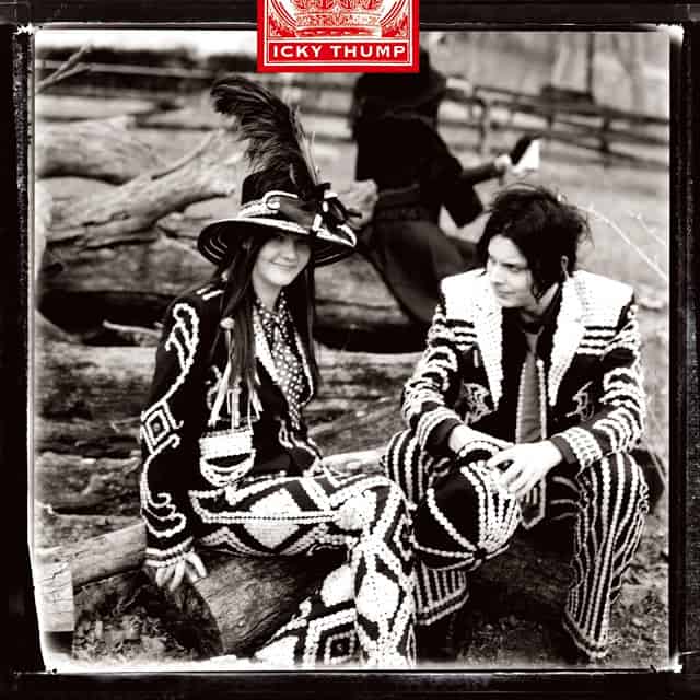
Rob Jones’ cover design for The White Stripes album ‘Icky Thump.’
For something like Icky Thump, again I get a big folder full of photos of Jack and Meg wearing the pearly outfits. I pitched 1 from all those that seemed to my eye the most ‘front cover.’ I then had to figure out the best way to introduce ‘red’ into the affair. I fucked around with tinting some elements, but it didn’t come off great.
I eventually pitched the tax stamp idea (I think I sent 5 or 6 versions of it) which the band chose as the best route. This was fortuitous as it served as the primary design element that linked all the single covers together.
For single covers, that’s usually me launching non-band photo ideas in relation to the song as I generally don’t have photos leftover or available of the band to use. The big two exceptions to this were ‘Treat Me Like Your Mother’ and all the ‘Blunderbuss’ singles.
For Dead Weather’s TMLYM single, I actually had a cover approved that utilized an image of Livia, the mother of the emperor Tiberius. At the same time, I had to make a quickie cover for promo CDs of the single sent out to radio stations and whatnot.
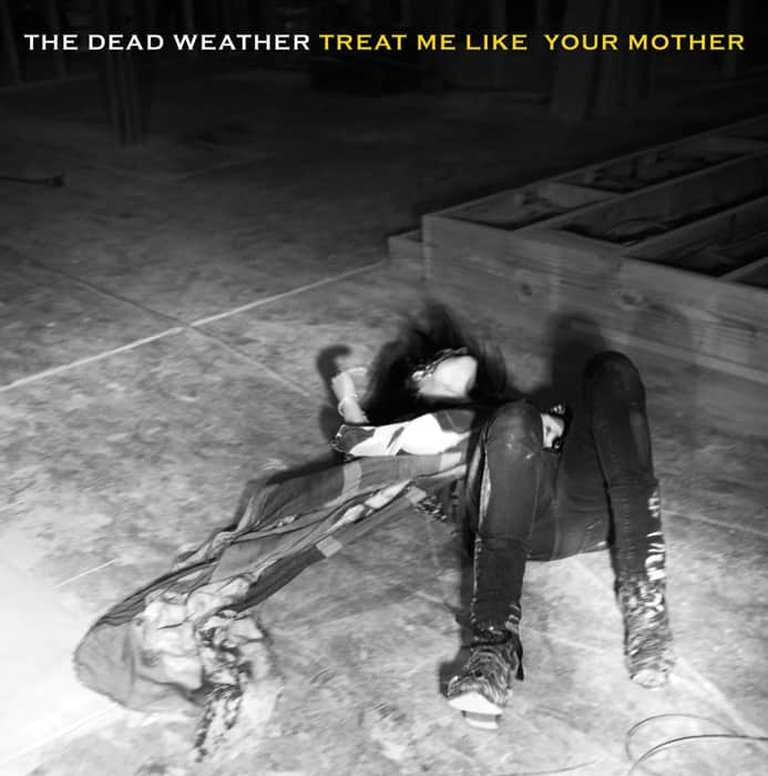
The Dead Weather ‘Treat Me Like Your Mother’ single design by Rob Jones.
I re-used an image of Alison writhing on the floor from the interior of the CD booklet. I really liked the image as it had, for lack of a better term, a ‘Samhain’ quality to it. That and I thought it was a wildly inappropriate picture to place beneath that particular song title. The result gilded my goose as it was just a more exciting cover than my already approved Livia / Alison meld. I suggested we switch them out. The band agreed.
Tomer Hanuka’s illustration used for Jack White’s singles from the album Blunderbuss.
All the singles for Blunderbuss, unlike past assignments, already had their imagery and concept thought out by Jack ahead of time. My job there was just treating the photos so they looked prettier than usual (mainly just whitening up the tiles and darkening the grout). I did, however, pitch the tour single idea sporting the covers drawn by Tomer Hanuka.
I’ve not had much luck with Jack liking posters from illustrators, but with Tomer, he really enjoyed the portrait he did of the White Stripes for Spin so it was an easy sell. Tomer, of course, did a top drawer job on them.
The Raconteurs gig poster by Rob Jones.
Your designs are incredibly smart and sophisticated. You create posters through found images and collage that feel natural, organic. Your Raconteurs posters are insanely creative, on the level of Terry Gilliam’s Monty Python animations. Others have that punk rock aesthetic – the days of wonderfully deranged photocopied fliers. Beyond the image already existing, what’s the advantage of using found art?
Time. There ain’t much of it during a tour with all the potatoes that have to be peeled (shirts, singles, tour books, etc). Using found art gives me time to experiment and allows me to make a lot more posters than illustrating things myself. The latter approach takes me forever as I’m too harsh a critic of my own rendering skills (well, probably exactly harsh considering some of the stuff I’ve drawn).
I might have 5 posters to do in a week, so I need mongoose blood. Being fast on say those 5 also buys me some construction days for a separate poster that I know will take me considerable time to complete. Robbing Peter to pay for Paul’s new suit, I guess.
The Dead Weather gig poster by Rob Jones.
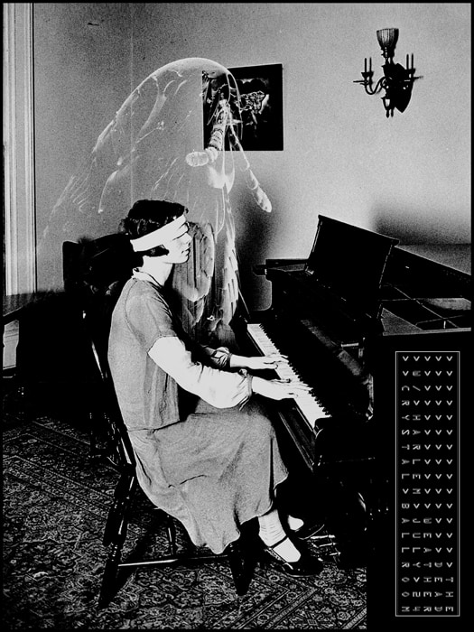
Another benefit is that searching for graphic ingredients fosters creative association. It bears imagery I doubt I’d come up with just eyeballing a blank canvas. For example, there’s a Dead Weather poster of a blindfolded girl playing piano.
I stumbled across the photo in some archive, and it made me think of Robert Blake. I thought of that quote Val Kilmer babbles on the beach in the Doors movie: ‘If the doors of perception were cleansed everything would appear to man as it is, Infinite.’ The full quote goes on, ‘For man has closed himself up, till he sees all things tho’ narrow chinks of his cavern.’
That girl presumably effortlessly playing while blindfolded echoed that sentiment that we’re blind to the reality that surrounds us. However, because I was in a Dead Weather frame of mind, I thought how that lack of perception is a safety device. You might not perceive the beauty of ‘the infinite,’ you might just become hyper-aware of pervasive malevolence, an invisible devil’s rain drizzling down from a taurobolium platform that spans the sky. That knowledge could drive you over the edge.
Blake supposedly saw the spirits of hideous killers, and he calmly drew what he saw as shown in ‘The Ghost of a Flea.’ Fleas, he contended, housed the spirits of murderers. Not all of us are Blake, either in perception or the matter-of-fact mindset to process what we can potentially see. Most of us need that blindfold to remain functional and unaware of the abyss. In that Blake mode, I decided to be horribly literal and show a mammoth spectral flea beside the piano player. As a further nod, I replaced the picture on the wall behind them with Blake’s ‘The Body of Abel Found by Adam and Eve’ which shows Cain madly fleeing his bloody act of fratricide.
The point is, I thought of that shit from seeing a chick playing a piano blindfolded. I could have drawn it, but that would take days and probably not be a tenth as creepy as the manipulated photos wound up being. If I hadn’t lurked around photo archives, I would never have had those thoughts. I might have randomly pondered Blake and the bugged eyeballs on his bust at Westminster, but I don’t know if I would have come with something that interesting (to me at any rate).
That’s a great point and a totally inspired train of thought. There’s a lot to be said for letting the brain wander and explore.
With such a love of classic engravings, have you tried your hand at doing your own? Is that something you’d be interested in doing? How much of your work is hand-drawn, if at all?
I have zero interest in pursuing that which is fortunate as I likely have zero amount of the skill needed to match even the poorest engraving technique. Back during the frontier days, I drew all my posters pretty much with the Pink Swords flyers. I wanted to be the next Kozik or Coop, as my aping in those early posters clearly reveals. However, my predominantly phallic celebrations met with mittened applause. As I said earlier, nowadays I generally don’t have time to pursue illustration much.
The last thing I drew for a job was a turtle with a shell comprised of birdhouses for a Danish film festival in Aarhus. I did that as that style seemed the best way to realize that idea.

Rob Jones’ poster for the Danish Film Festival in Aarhus.
That actually involved some funny art direction as they initially feared it was overtly twee. I turned in the piece, and they asked if there was any way to put a little darkness in it. I thought about it and then just had a snake eating one of the birds. The client then gave the thumbs up.
A total surprise a bit later when they sent me an animation of the poster featuring the big turtle stomping around downtown Aarhus.
What’s your library of material like? Do you have stacks of books with images and photographs to pull from? Is it already digitized? Curious to know if you sit at a desk and physically cut up magazines and books, tape and glue collages together before scanning it into Photoshop, or if it is all done digitally.
I have shelves creaking under a ton of engraving books. I’ve also been fortunate to make friends with Jim Harter who put a lot of the Dover ones together. I’ve been to his joint a few times and rifled through his collection to pull images I might have a future need for (mostly mechanical items, spooky stuff, and various historical figures).
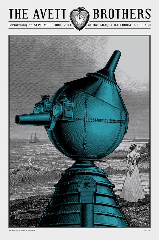
Avett Brothers gig poster by Rob Jones.
I compose it all digitally. The advantage, besides not cutting the shit out of my books, is that I can adjust the sizes of various elements so the engraving lines for objects in the same plane are about equal. I also, and this is the hemorrhoid of the procedure, zoom the fuck in and round off every area where engraving lines from one element hit the edge of another element.
Just a pixel or two ticking away at the corners, but it helps integrate the elements better into an attractive whole. The goal, although not always realized, is to make it look like a full piece that I just happened to find rather than something laboriously cobbled together.
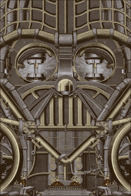
‘King’s Lead Hat’ by Rob Jones for Mondo’s Star Wars show.
Your poster ‘King’s Lead Hat’ for the Mondo Star Wars show is just gorgeous, not only in design but in its narrative. Depicting Darth Vader as a walking fear machine, a Death Star on two feet is a totally brilliant way to approach the character.
It had to be difficult to work with a property like Star Wars, something that is so beloved and ingrained in our culture that every aspect of that film has been pulled apart in some way or another, which makes your poster so unique. You found a new and interesting angle on a classic.
When tackling Star Wars, where did you start? How many attempts did you go through before you decided on what became the ‘King’s Lead Hat’?
Just two. My first attempt came from some Dead Weather posters I mentioned earlier, the ‘gunfaces.’ A lot of Dead Weather lyrics to me sound like howlings from damaged characters, creatures resolute in maintaining an emotional distance from others.
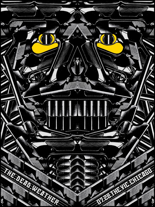
The Dead Weather gig poster by Rob Jones
I depicted this in various ways, but my favorite at the time was creating monstrous visages from a repeated image of a small handgun. I imposed a lot of rules on myself as to how I could construct them.
Mainly I couldn’t alter the guns if a little piece here or a piece there was showing by erasing a tiny portion. I had to use the whole gun on one side of the ‘flip line.’
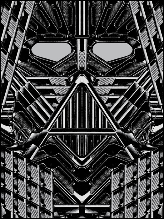
Gun version of ‘King’s Lead Hat’ by Rob Jones for Mondo’s Star Wars show.
Anyways, I thought this approach would apply to Vader, someone that’s covered himself in armor to keep any sort of empathy at bay. No flesh, no ‘softness’ showing. Lucasfilm frowned on constructing the character from firearms as Star Wars is intended as a children’s movie. It seemed weird to me since the character is a child-killer in a nazi helmet, but what can ya do? I sat down and powered through an engraving take.
I imagined it as part of the world where all the Raconteurs lobby card posters take place (hence the little cowboy clone soldiers at the bottom). It was a pretty brutal construction. A lot of times it really feels like it’s not working and I’m probably wasting my time. However, I know if I push through then the solutions will come. That said, I wish I had a little more time to figure out the eyes better, but the clock cracks a loud whip.
Here’s an egg of Astarte for you, there are five small kanji for ‘death’ scattered about the poster. If you connect them up they form a pentagram (i.e. a Death Star).
You’re able to totally ride that magical line between spontaneity and extremely planned and detailed work. Both versions of Vader are just incredible. I’m surprised we haven’t seen more of your work in the world of Mondo. Will we see more of your posters for Mondo, or are you sticking with being behind the scenes?
I dunno, I keep meaning to. We’ll see what the year brings. With our new Marvel license, there are two characters that produce a Vader-level amour deep within my blackened chest. It might prompt me to do a poster of at least one of them.
When I interviewed Jay Shaw he mentioned how important your input is to the design process. I love Jay’s work, it’s like some strange and hilariously wild nightmare. What’s your process as an art director for someone of Jay Shaw’s caliber? How do you blend the goal of what Mondo wants, what the studio wants, and the talent of the illustrator you’ve commissioned?
Just talk straight and cogently explain why something doesn’t work or how it could be improved. Most people just fucking suck on the ‘explaining’ part. It also helps if the person you’re explaining things to thinks your opinion is worth a shit.
Not often, but on occasion, we definitely have to fight with a studio. Sometimes we win and sometimes we lose. If I told you about some of the ones we lost, you’d cry.
When working with an illustrator on a poster, where does your own personal style come in? For someone like Rich Kelly, as the art director, are you there to push the design into bringing out all of the Rich Kelly-ness it can possibly have, or does some of your own style get in there, like, ‘If I did this Son of Frankenstein poster, I’d do it like this.’ I imagine it to be a ‘coach and player’ dynamic, but that’s just a blind guess. Where does your personal taste come in to play?
I guess just shit that looks off to me. Varies from artist to artist and situation to situation. Shit can come in perfect and there’s nothing for me to say. A piece can be an utter cataclysm and I have to work with the artist to figure out a better approach or concept. Sometimes it’s a minor cataclysm, but there’s not enough time to save it so it has to go out with a gammy leg.
I try to keep it as much the artists’ vision as possible though. I’m not comfortable saying how I might change someone’s artwork as I don’t want to look like I’m trying to get credit for their labors. I’d rather just leave that to an individual artist’s discretion to say what hand I might have had in a piece on their own. Unless I’m in a bar and speaking privately, then I’ll tell you all sorts of shit.
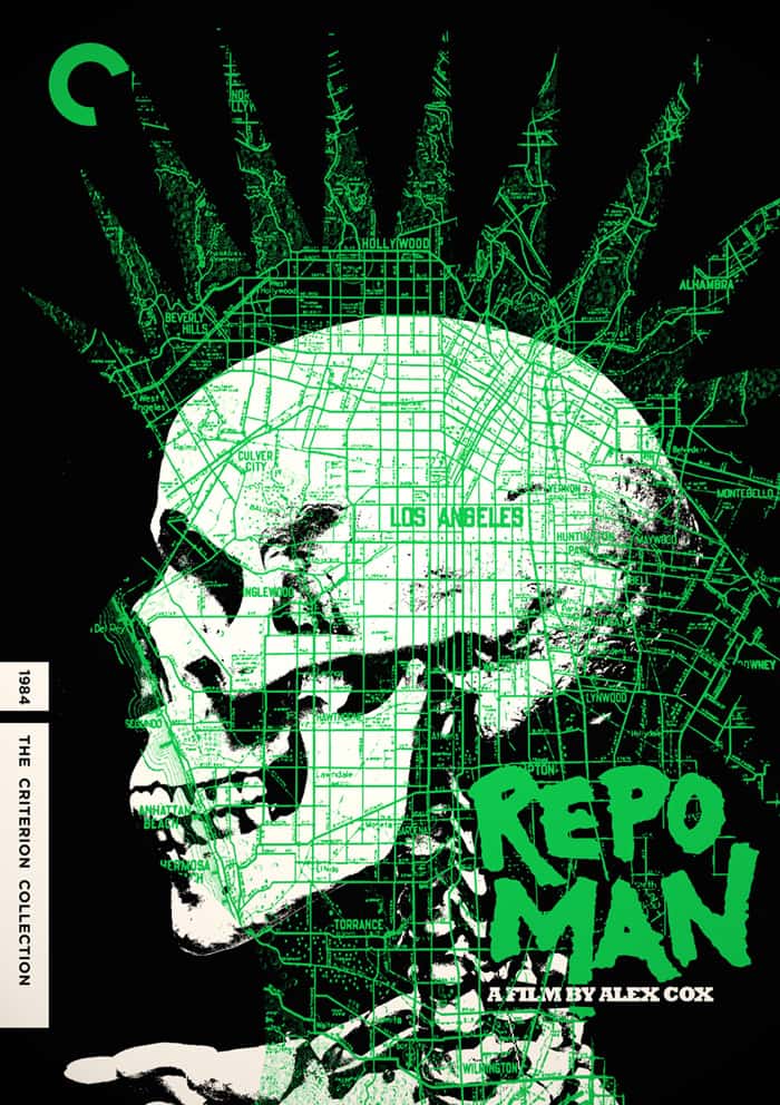
‘Repo Man’ Criterion Collection design by Jay Shaw
For Criterion your role is a little different. The recent ‘Repo Man’ release is pretty damn amazing, and the fact that it works so well with three illustrators working on it is awesome. What made you decide to include Jay Shaw and Tyler Stout on that project?
They said ‘yes’ and could submit something quickly. Sarah Habibi, the exquisite art director over at Criterion, asked if I had ideas for Repo Man in a hurry. I suggested myself and 4 other artists that I could count on for celerity. Criterion liked what I sent in from Tyler, Jay and myself. Jay sent in around four takes, but the skull one was the obvious stand-out. It came in, and I zoomed it over to Sarah calmly exclaiming, ‘I think this is the one. I can’t imagine something that could beat it or better capture Repo Man in a single image.’
I gave a quick rundown on how to use Tyler’s excellent artwork and then what could be done for the interiors and booklet. Sarah then essentially said, ‘Wind the mouse.’
‘Repo Man’ by Tyler Stout for the Criterion Collection
Sarah and the producer on the disc were pointedly enthusiastic about what we proceeded to deliver. I only recollect 2 real notes of consequence during the entire affair. One was a demand for reworking the DVD menu image for the Iggy Pop featurette (I wound up making 3 or 4 of those before the producer approved one).
The other was to infuse some chromatic variety into the booklet so that neon green wasn’t the only pop color. I was hesitant about that as I’m a real matchy-matchy motherfucker. I decided to only introduce red and yellow as additional colors since they were already found in Alex Cox’s illustrations that comprise the bulk of the booklet. Also, combined with the already present green, those particular shades constitute the colors of a traffic light which seemed appropriate. So yeah, great art direction from them on that point.
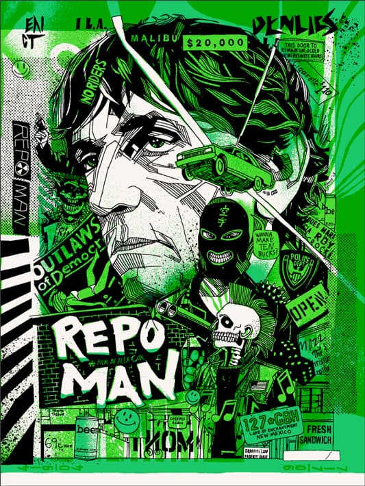
Here’s something mildly fun. For the punk flyers, I essentially challenged Jay to a night-long contest. We limited ourselves to 40 minutes tops for each flyer. We’d start the timer, work on a flyer, and then sent the results to each other to determine a winner. Then we’d start the timer again and again until we had enough fliers to fill the interior of the digi folder.
Also, check out the maps that I drew on some of them. They are for real LA places of interest that I’m fascinated with while providing an element authentic to many of the posters from that period. I’m from a tiny burg, so no fliers I ever saw had maps as there were only about 2 or 3 places to play. We had illegal boxing matches that would move around a lot, but that was always word of mouth.
Jay and I actually just got done working on another Criterion project for their upcoming release of Altman’s ‘Nashville.’ That one was a different ride with Criterion, but we’re both very proud of the final result
For ‘Repo Man,’ each of you brought your own voice to it, but overall – man, it just works so well together. Criterion always had collectability to their collection, but they’ve really been upping their attention to packaging lately. Venues like Mondo and Criterion are doing a fantastic job of acting as a showcase for some amazing artists, and your hands are all over some the best modern work being done. Dude, you won a Grammy already. Are there any avenues you want to explore, creatively?
I’d love to raise Markhors. It’s an awesome endangered goat native to Pakistan and surrounding countries. Apparently they’re adaptable to Texas weather. Creatively, I guess I’d attempt to engage in selective crossbreeding to spawn some sort of huge Uber-Markhor (maybe with four horns if I brought some Jacob’s Sheep jizz into the equation).
Down the line, I’d hope to produce some fire-eyed 20-foot tall goat (10 of those feet being its horns) that eats smaller goats. Kind of like those folks in Poland attempting to create quasi-tarpans, an extinct primitive horse.
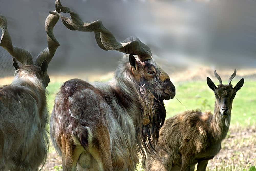
Markhor, the Pakistani dream goat of Rob Jones.
There’s a smaller descendant of the tarpan called the Konik, and apparently they are taking the Gheorghe Muresans of the herds to fuck a giant Konik into existence that resembles it’s ceiling bumping ancestor. That animal husbandry shit fascinates me. That and I really enjoy watching goats at zoos.
Maybe I’ll take it up when I’m older and my misanthropy finally hurtles me out into the country where the land’s cheaper. I’d love to paint too, but I don’t have the patience to develop the skill. It would likely result in a lot of punched through canvases.
The White Stripes gig poster by Rob Jones
The White Stripes gig poster by Rob Jones
In an interview you did with Nerdlocker, when asked about your success, you said, ‘ I’ve learned you can buffet your reputation and collectibility by making posters for successful bands. That about sums up the “secret”. I doubt I’d enjoy many plaudits if most of my work surrounded some unknown math rock band from Winnipeg.’
This stuck with me. It’s a very humble response, but I’d say there’s more to your success than just working with popular bands. I’d like to think, or hope, that if you’d done something like your poster Spoon’s shows at Stubb’s or your Avett Brothers Tin Man design for a small, crappy band in the middle of nowhere that would have still found the success you have now. With work that strong, I can’t believe it would go unnoticed too long.
When choosing illustrators for Mondo, do you consider their reputation and collectability? With the reputation that Mondo has for quick sell-outs, is that something you guys consider when working with a new artist?
We choose who we like (or who Mitch and I can agree on). Sometimes it’s a Fairlane, and sometimes it winds up an Edsel. There are a number of artists we will use repeatedly that don’t appear to have a rabid following amongst Mondo fans. However, we respect these artists, and other artists love their artwork. We keep using them hoping eventually folks wise up.
There’s a story about Junior Brown when he first started to play the Continental Club here in Austin. Apparently, despite his wizardry on guitar and stage presence, he had difficulty filling the venue. He felt terrible for the club owner and suggested that he should probably book him less. The club owner essentially said, ‘Fuck’em, the audience will come. You’re too goddamn talented for it not to.’ Time whizzed, and the club owner was proven correct, and a Junior Brown show became a crowded ticket to get. I will say a version of that story to artists every once in a while when their poster doesn’t sell out immediately (on our site or theirs).
You can’t be guided by polls, even if they’re taken in sales. You have to use your gut compass and procure what you feel is talent worthy of a klieg light.
Damn, any creative who has you in their corner is a lucky bastard. I saw that you spoke at BIGSOUND, a massive music and design convention in Australia. It’s like, even on vacation you find work. Is there a separation between work and pleasure for you?
If you work long and hard enough, you’ll find yourself anxious if you do without it for any stretch of time. It’s like cigarettes and can become a disgusting habit, especially for your spouse.
BIGSOUND was fun. I got to booze out with Ken Taylor and Webuyyourkids’ Sonny Day for a good stretch. I got to see an incredible Amanda Palmer show. If you have a musical band or performer you intensely admire, try to see them in another country if the opportunity presents itself. It’s been my experience, although I only had it twice, that it’s a way different show.
I saw my all-time favorite group, The Damned, at the Roundhouse in London. Totally different sort of show and crowd than I’m used to seeing in the States (at least to my ears and eyes). Captain played a couple of bars of the ‘Turkey Song’ for instance which would be too deep a track I think for general American audiences.
Rob Jones, Grammy winner. Trophy hoister.
And that, my friends, is Rob Jones. A man with an endless core of practical magic, knowledge, and inspiration.
I recommend checking out Rob’s site Animal Rummy Dot Com and reading his own short essay on the birth of his Darth Vader poster, ‘King’s Lead Hat.’ A smart read.
More recommended reading —
Rob Jones interview with Nerdlocker
Rob Jones interviews with Lights Camera Austin
![]()
2 thoughts on “Interview: Illustrator Rob Jones Dreams of Pakistani Goats”